Showing posts with label techniques. Show all posts

Multi-Color Stamping


Hello Friends!  It's so nice to have fun tools to help you with art and today I wanted to share how I made this card...my multi-colored sea turtle scene.

Directions: 

Trim a piece of white cardstock a bit smaller than an A2 card.  

Place the card panel into a stamp positioner (like a Misti or similar tool).  

Center the stamp on the card panel face down on the panel, close the lid of the positioner and open. Your stamp should now be affixed to the lid.

Ink the turtle portion of the image with desired color then stamp.

Now it's time to have fun. I like using my Memento Dew Drop Ink Pads for this technique as you can add ink in smaller areas than you can with larger pads.  Select desired color of ink and dab it onto portions of the image and stamp.

Repeat with one or more additional colors until the entire image has been stamped on the card.

The results will be a very colorful fun card!
Hope this has inspired you to play a little with your stamp positioner!

Imagine & Precious Remembrance Blog Hop Day 1

Welcome to Day 1 of the 
Be sure to check out the details at the bottom for a nifty GiveAway!
The complete list of hop participants can be found on the 


Today I have a set of cards that I made using the "Totally" stamp set paired with Kaleidacolor ink pads to create monochromatic color theme. It's amazing how the color of the inks "totally" change the feel of each card. Check it out....


The first card was made using the Fresh Greens Kaliedacolor ink pad. These greens give off a tranquil and relaxed feeling like you would experience walking through a lush forest or open meadow.


While blues are often associated with calm and serene landscape of the ocean or open sea this Blue Breeze ink pad surely offers up a bit of calm and comfort.


While this example isn't really a monochromatic ink pad, Berry Blaze and it's coordinating color scheme has an arousing, energetic feel about it...like you're ready to take over the world. 

Even though all of these cards were made using the exact same stamps the colors really play on your emotions.

Imagine & Precious Remembrance 
Giveaway Details:
- Hop Along and leave us some comments on each blog. 

- Show us some love!:) Like & Follow both companies on Facebook & Instagram 


- Have fun & Good Luck!


Precious Remembrance Shop: Facebook , Instagram

Imagine Crafts: Facebook , Instagram

1 Winner : School Days & Totally stamp sets (Precious Remembrance Shop)
1 Winner : $30 Gift Certificate from Imagine Crafts


Supplies

Imagine
Kaleidacolor - Blue Breeze, Fresh Greens, Berry Blaze
VersaFine Clair - Nocturne

Precious Remembrance - Totally Stamp Set

Other -
Cardstock
Faux Gemstones
Twine - May Arts

Spotlight Rose

Good Morning All! 

I hope you're having a lovely day of it.  I want to share a lovely vintage looking rose from Lost Coast Designs that I stamped using the Spotlight technique.


It was created for the current Yellow and Orange Challenge over at Lost Coast Designs & Carmen's Veranda.  

Please hop on over to the blog to check out how this card was created....


I would also like to enter this in Double D's challenge - May Flowers

DecoArt Pouring Medium

Hello Friends! 

I'm sure most of you have heard the chatter or seeing examples of one of the latest artsy trends...Paint Pouring. I have been resisting the urge to joining the fray but I could resist no longer. DecoArt has come out with Pouring Medium and Top Coat to make the process so easy.


These are my very first examples of my first attempts at this art form and I have to say that I am so pleased with the results and I couldn't have had more fun with the whole process.  But, I'll let you be the judge of my results...  Oh and I didn't add anything to mix...I simply used the DecoArt Pouring Medium and Acrylics.


I started off by gathering all of my supplies....a low profile cardboard "pizza box" to work in; cups to mix paints in and a larger pouring cup; wood stir sticks; DecoArt Media Fluid Acrylics, DecoArt Americana Titanium White Acrylic Paint; and of course the new DecoArt Pouring and Top Coat Mediums.

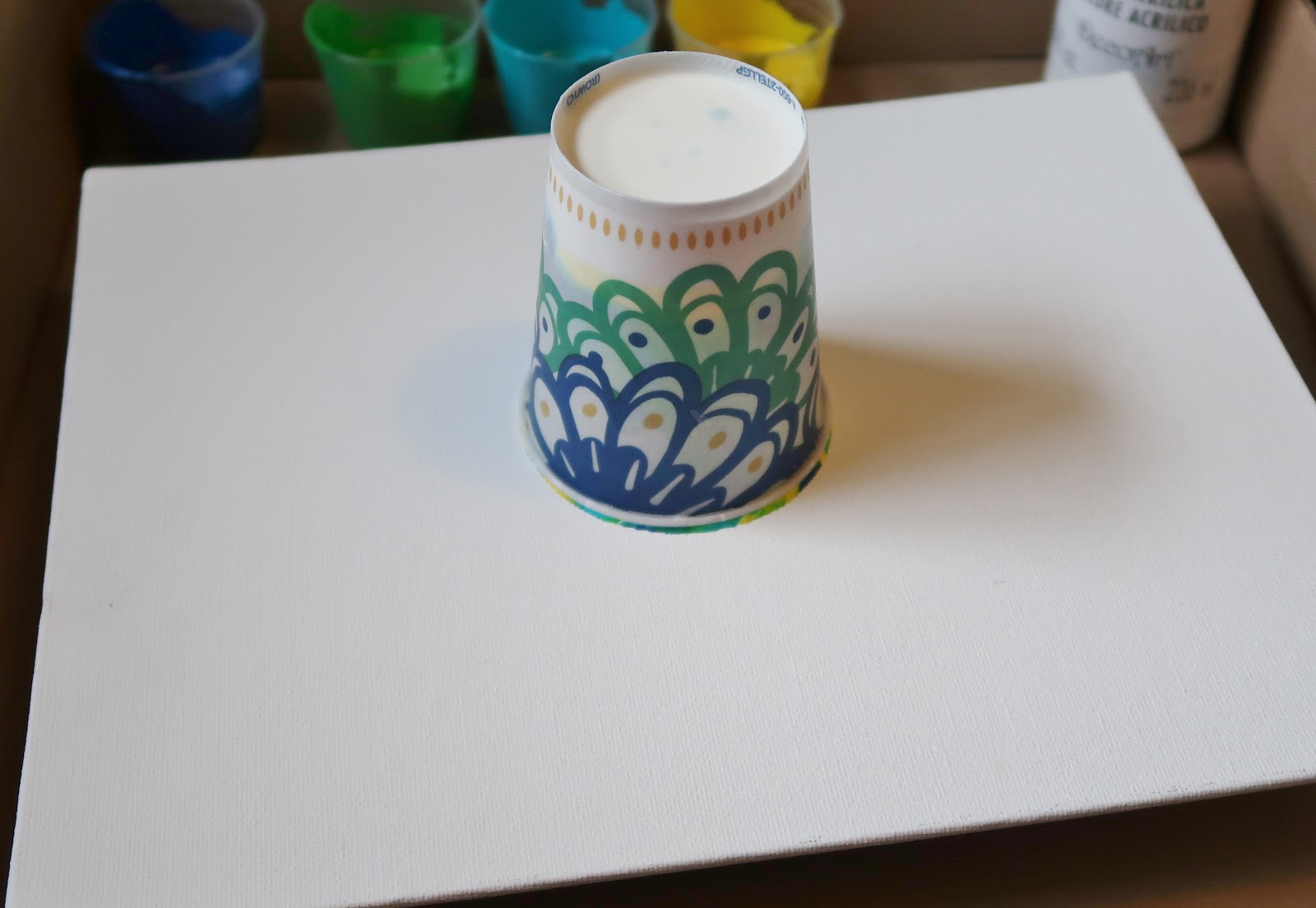
I wanted to try a variety of substrates so I used 2 different size stretched canvases from Canvas Corp., a flat canvas panel from Dick Blick and a 1.5" deep chipboard box that was in my stash. To help hold each piece off of the bottom of the box (so the paint didn't pool on the bottom of the canvas) I used push pins on the dimensional canvases and placed the panel on small cups.


Before I began I put the Pouring Medium into a squeeze bottle so I could better control the amount I used in each color.


I followed the recommended mixing formulas for each type of paint, in these examples - Fluid Acrylic 2:1 paint:medium; Craft Acrylic 1:1 paint:medium.  Since I had these handy little medicine cups I went with 5mL = 1 so the Fluid Acrylics I used 10mL of paint to 5mL of Pouring Medium and 5mL of Americana Acrylic paint to 5mL of Pouring Medium.


After I had everything measured out I stirred and blended the paint/medium thoroughly.  I've heard some people say that this step takes a long time. Personally I didn't think it took long at all - about 2 minutes or so. I did have my colors picked out ahead of time so maybe that's what takes them so long.


The first technique I wanted to try was a Cup, Flip or Dirty Pour (seems everyone has a different term they prefer) basically you layer all of your colors into a single cup then flip it over onto your canvas and let the paints/medium do it's thing.


So I layered in my paints...


then flipped the cup upside down onto the canvas panel.  I let the cup sit in this position for a couple minutes to let the paint migrate to the bottom.


And then...the magical moment - I lifted the cup and let it flow.  I tilted the canvas this way and that to help move the paint towards the edges.  I must point out that I used far less paint than most folks do. Why? Well, if you've visited here before you know I'm pretty frugal and don't let anything go to waste (more on this further along in the post).  

Up until last night I was under the assumption you HAD to use huge quantities of paint to make this type of art form. WRONG....I watched a few videos on it on YouTube and it wasn't until I happened upon a video from Myriam's Nature.  She actually did the math and measured out the paint she needed for the size of canvas she was working on.  Cool!!  I didn't do the math but I did a rough estimate and came pretty close so I had very little waste.


And here's how it turned out...at this point it's still drying but the pattern has pretty much set. The photo at the beginning of this post shows each of the finished canvases with the DecoArt Topcoat applied.


This example was made by pouring the paint from each mixing cup directly onto the canvas in side by side lines. I then tilted the canvas here and there until I liked what I saw.  


The third try was a bit of both of the first 2 techniques, initially I poured a bit of paint onto the canvas; moved it about then poured the light blue and yellow over the top of the already poured paint. The initial pour was starting to dry a bit so I picked up the canvas from one corner and banged it onto the work surface to create these cool breaks.  I LOVE the look...don't know if I'll be able to reproduce it or not but it will be fun to try!

Now you might wonder why you didn't see this in the first photo of this post...well, you have to have a bit of patients for this art - I got a bit anxious and touched this canvas right in the center before it was all the way dry....needless to say I messed it up good.  Soooo, you will need to leave your painted canvases to dry for a good while before you check them ;) 


My final example was made using the swipe technique. I scraped the paint out of each mixing cup and the pour cup onto the left hand side of this canvas. I then used a baby wipe to drag the paint across the canvas from left to right. After I had dragged the paint I let it dry at a 45 degree angle.  As you can see it created a really cool pattern as the paint slid downhill.  It is still wet here which is why the photo is sideways...I didn't want to attempt to move it after the fiasco with the other canvas.


Finally, remember I said I hated to waste paint...well I moved each canvas from the box I poured in and picked up the "run off" paint with the baby wipe from the swipe technique and swiped it across a piece of cardstock!!  It turned out amazing, I can't wait to use it on some cards.

All in all this was SOOOO much fun! I loved it.  I will be doing many more "pours" and can't wait to share them with you.

So, what do you think???


Supplies:
DecoArt-
Pouring Medium
Pouring Top Coat
Media Fluid Acrylics - Primary Yellow, Primary Cyan, Yellow Green Light, Cobalt Teal Hue
Americana Acrylic Paint - Titanium White
Canvas Corp - 4x4x2"; 5x5x1 canvas
Dick Blick - 8x10 canvas covered panel
Unknown - 5x7x1.5 Chipboard Box
Push Pins, Measuring Cups, Pour Cup, Wood Stir Sticks, Pizza Box (to work in)

Starry Northern Lights

I am so excited...I really like the Northern Lights technique but it always seemed rather flat. Imagine's new VersaFine Clair ink changes all that!!!  Check it out.....


Isn't it stunning?  Well here's the deal, the VersaFine Clair inks dry quickly, just like regular VersaFine inks BUT they have the unique properties of being able to hold embossing powders even after they feel dry. It's wild!!  So you can ink up an entire piece of cardstock with a variety of colors (without rushing) then sprinkle the EP to emboss the entire page!  Now the Northern Lights really knock your socks off!  Check out the comparison below...


With VersaFine Clair & Sparkle EP....


And without...

You can really see what a difference it makes.

For information on how the main card was made, please see:


December Technique Challenge - Repeat Stamping!

Hello Friends! I am the host for December's Technique Challenge on the Club Scrap Blog and I choose Repeat Stamping!  This is such a fun and easy technique and it yields soooo many different looks - let's check it out...


Grid Stamping...
I used a ruler and pencil to tick off stamping marks.


All in a row...


You can use sentiments to repeat stamp for a fun look.


Layers of the same stamp make a remarkable card!


Combine repeated patterns for a fun layered look.


Tilt your card on it's axis to stamp multiple lines of images.
Makes for quick work but yields a complicated intricate look!

If you give repeat stamping a try please share!
And if you use a Club Scrap stamp/materials be sure to enter the linky party for your chance to win!


Supplies:

ClubScrap.com - cardstock, stamps, embellishments
Imagine - VersaMagic (chalk ink); Memento Ink; VersaFine

Heartfelt Sympathy Card

Well they are not a fun part of life but they are a necessity...sympathy cards that is. Just because it's a sad time doesn't mean it can't be beautiful as well.


If you'd like to see how I made this card, please check out the post below...


Supplies:

Imagine

VersaMagic � Sea Breeze, Aegean Blue, Night Sky, Ocean Depth
VersaFine � Onyx Black
VersaColor � Lime
Memento Inkpad � Ivy Cottage, Olive Grove


Other

Watercolor paper
Cardstock
Cardbase
Stamping block
Altenew � Vintage Roses 

Quick Torn Border Cards

Like the old saying, don't cry over spilled milk - don't cry over torn paper because there are so many FUN ways to use it!!  The November Club Scrap Technique Challenge is Torn Paper!

There are so many fun techniques that you can use torn paper with (you'll see several techniques on the Club Scrap blog in the above link). I wanted to do something a bit different so I gave it some thought and decided upon border pattern papers. 

Sometimes I have a difficult time using up those papers with pre-printed borders along one edge or the other because they are so big and I don't want to "waste" it - LOL!!  Ya know if you cut it up for cards you're going to end up with a small bit left over - what am I going to do with it? I can't throw it away, I don't really scrap 12x12 much but again, it's just too pretty to toss the excess so subsequently I have loads of papers with the borders still intact.  

Well it occurred to me that if I tore the border strip from the paper and cut it into 3 - 4" pieces I would have a great border for not one but 3 cards!


I started off by tearing and cutting up the border strip. I then used VersaMark ink to stamp the background of each card panel. Affixed the border, stamped a sentiment and embellished!


The background stamping didn't show up very well on the lighter cream colored cardstock so I stenciled on the little chef using Dark Brown Shimmer Delicata ink.


I'm really pleased with how they turned out and I didn't realize until I was done with them how quickly it went! That sparked a fun idea on making lots of cards in a short amount of time. I love it when things like that happen!  SO if you have a bit of time, give it a try and see just how quickly you can make lots of cards using torn borders!

Supplies:

ClubScrap.com - Trattoria Papers, Stamps, Stencils
Imagine - Delicata - Dark Brown Shimmer; VersaMark; VersaFine; Sponge Dauber
Faux Gems


And I thought I'd mention that I am now on Instagram...I've never done it before and I'm just startin' out but if you'd like to follow you can find me here:  @inkstainedroni  Hope to see you there :)