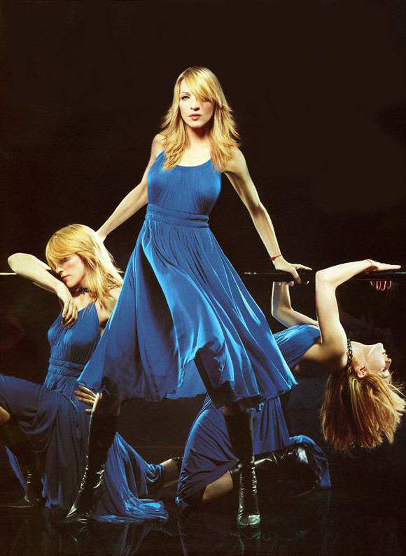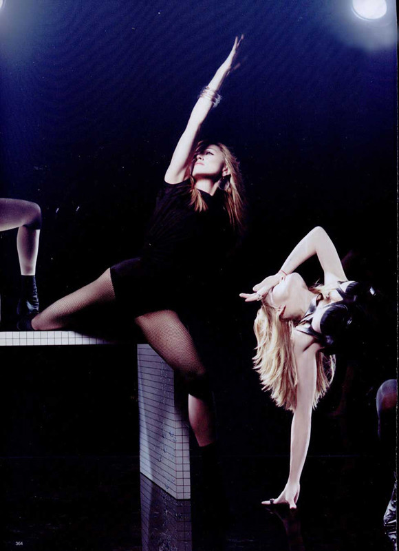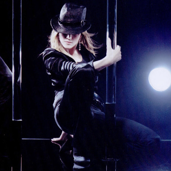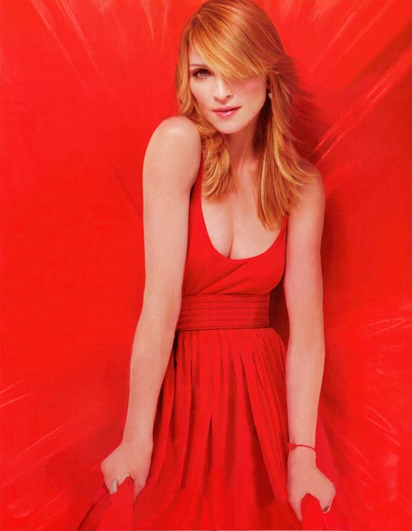
The issue at hand is March 2006 with Madonna on the cover. The spread of Madonna's movements cut/pasted on top of each other was incredible to me. The standout colors of the garments or even the black satin in front of black. And it all really reflected from the great lighting. At the time, I really didn't know about fashion, really. I barely knew Madonna. But something stuck with me from that issue, that spread. How could something not?
